Flightplan Project
Mapping prices to earth's surface
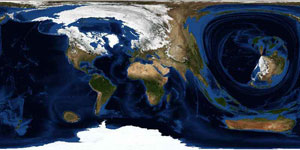
An question I was thinking about was: "How far is it to travel to the US compared traveling to Africa if you only look at the prices? How does the earth look like? Does it change every day?
For that we queried an travel agencies backbone database every day to fill a distance matrix with prices. Once we got all prices we began with deforming the well known earth's surface.
The result is a picture where you can see how far (in $ or €) it is, to go from A to B.